


1. TESTING WHAT ALREADY
EXISTS
1. TESTING WHAT ALREADY EXISTS
Learning about actual pain points and verifying the usability of the current onboarding flow
Since there's an existing testing platform, we decided to confront it to the users criticism so we can assess the pain
points they are facing.
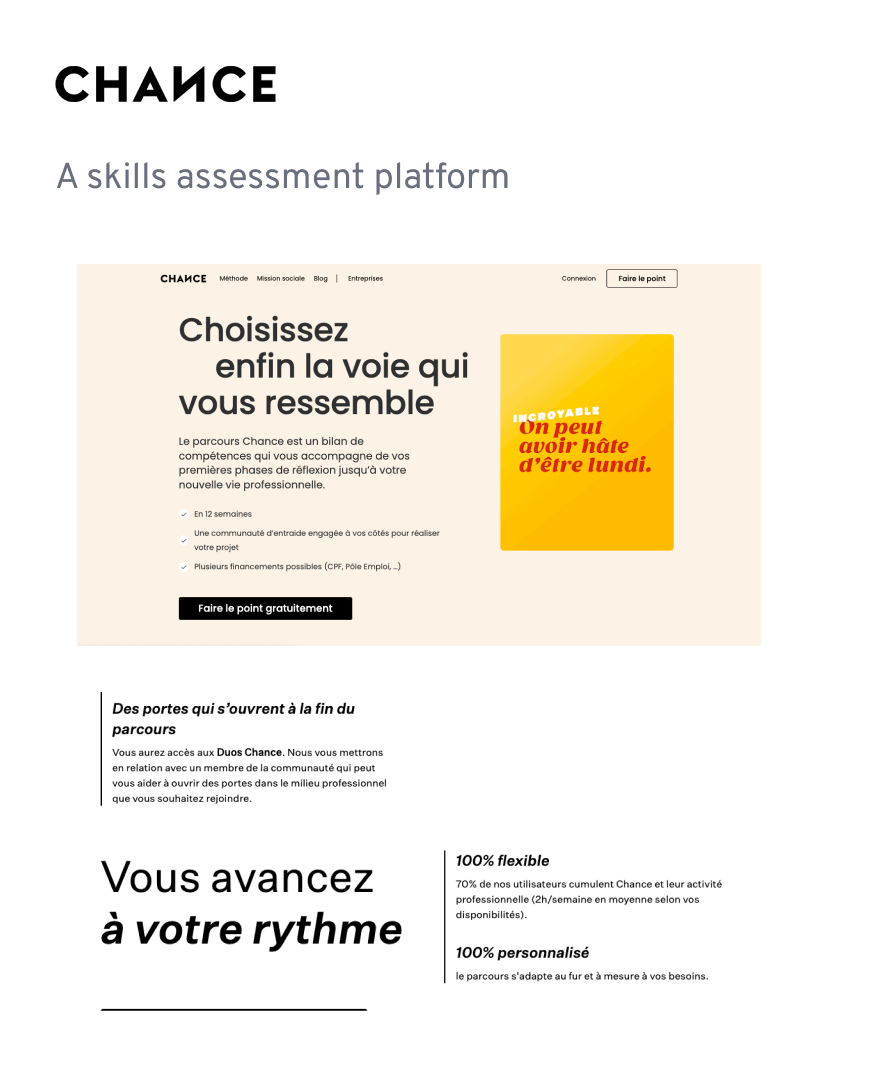
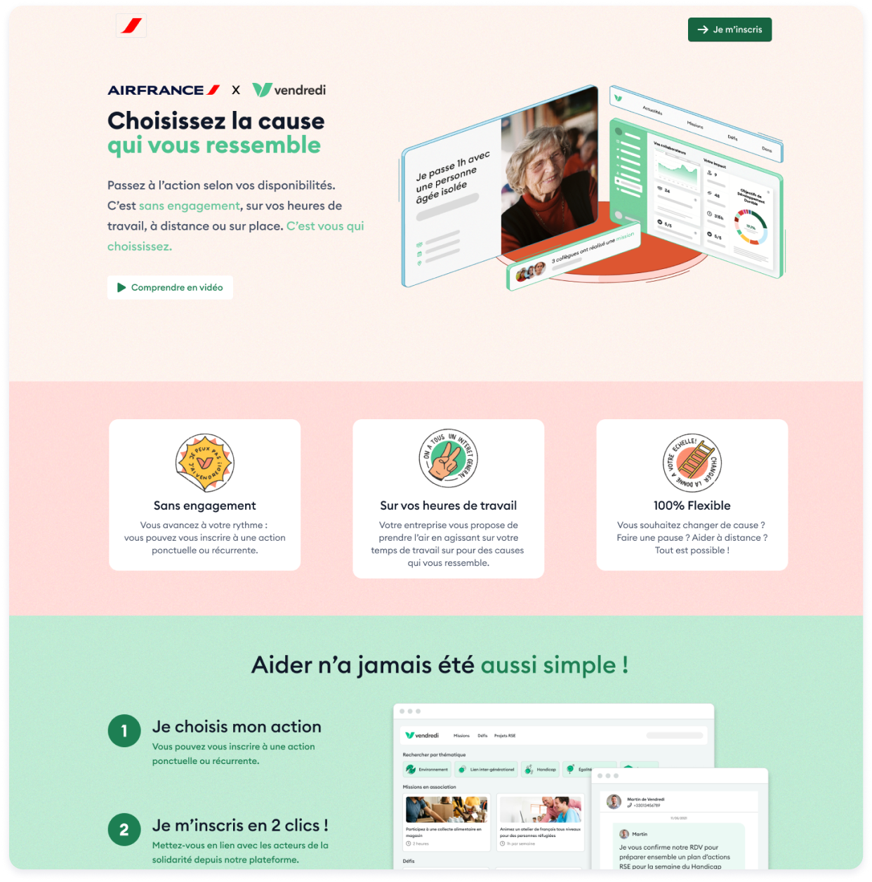
During the briefing, David and Valentin from Vendredi deliberately remained vague about the definition of the term
'onboarding'. Thus we decided to test everything starting from the first email the employee receives as it is the first
contact with Vendredi.
We wanted to know...

How do they perceive the current Vendredi onboarding?

What's pushing them towards or away from commitment?
Method
Panel
- 2 women / 5 men
- 27 to 39
- Various degrees of interest into CSR (not interested to very committed)
Scenario
- After a meeting with their CSR team, the user receives an email from Vendredi.
- The user has to sign up and complete the onboarding flow.
What did we learn?
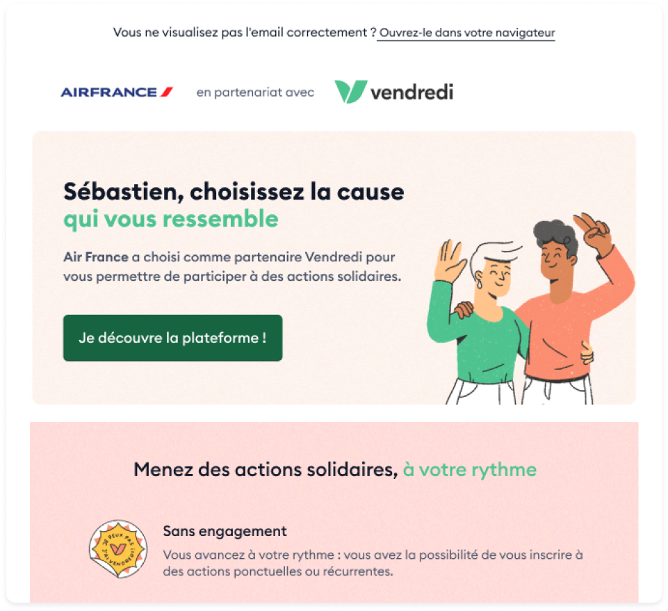
1. Email
4/7 participants have second thoughts before clicking
- The value proposition is hard to understand and they were worried about the prospect of commitment.
There's not enough information for me to commit to this.
2. Landing Page
5/7 participants were confused by the Landing page
- The landing page is not very engaging. They aren't sure of what they are getting into.
- The main Call To Action (CTA) ”Access to my citizen dashboard” was deemed intimidating and unclear.
I am trying to sign up, but all I can see is ”Access to my citizen dashboard”.
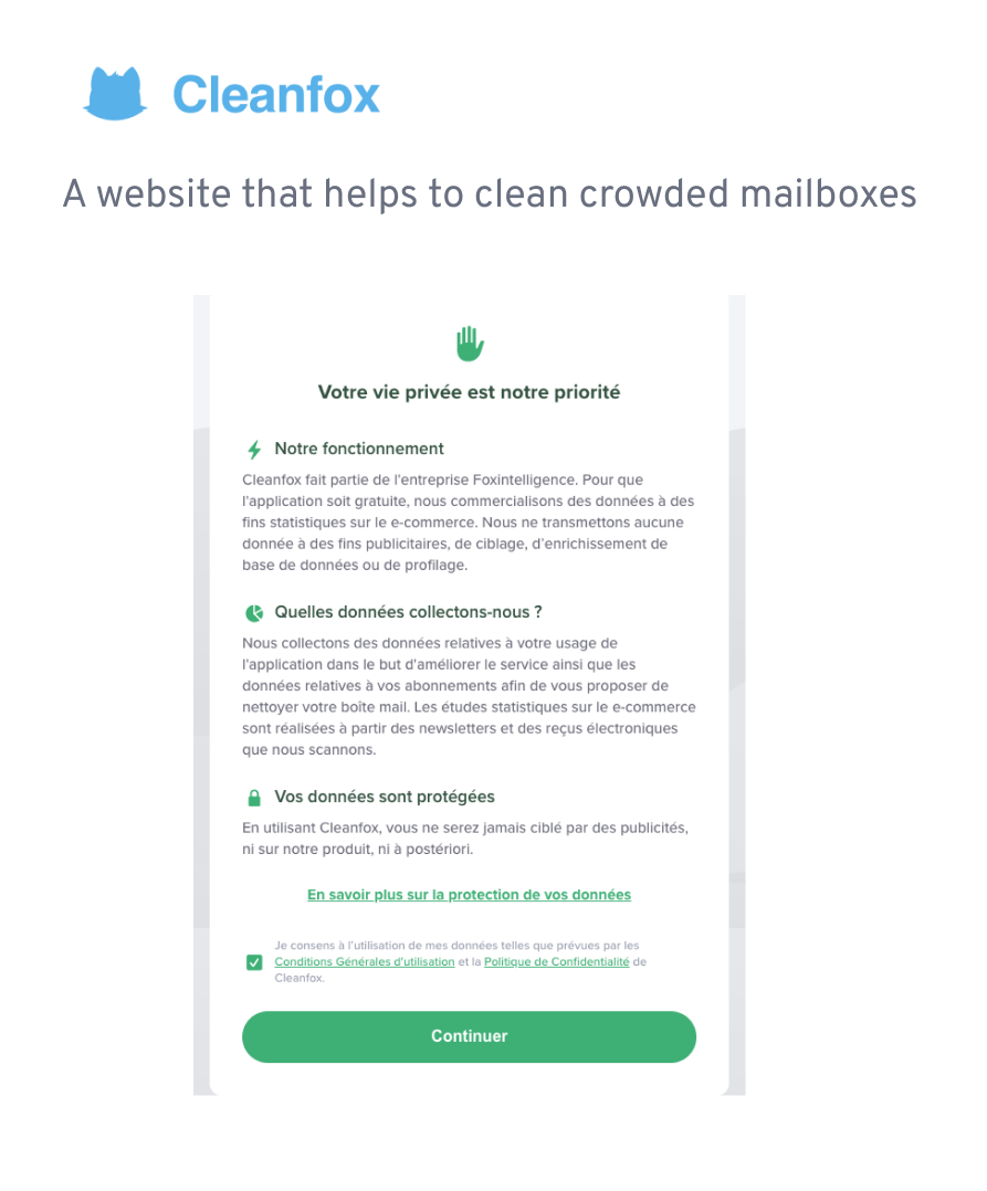
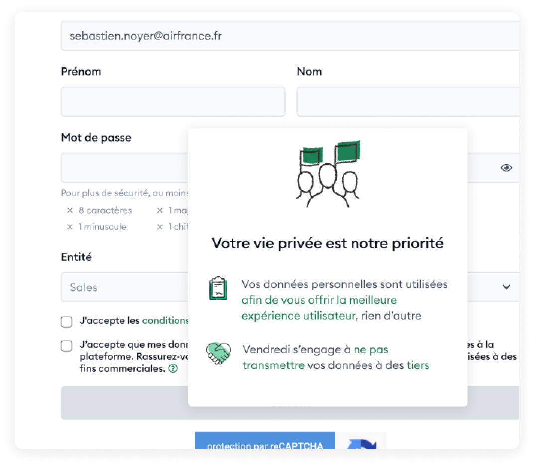
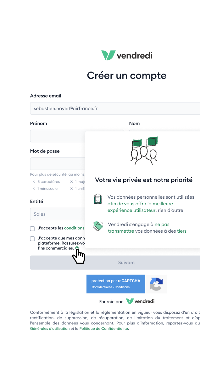
3. Sign Up
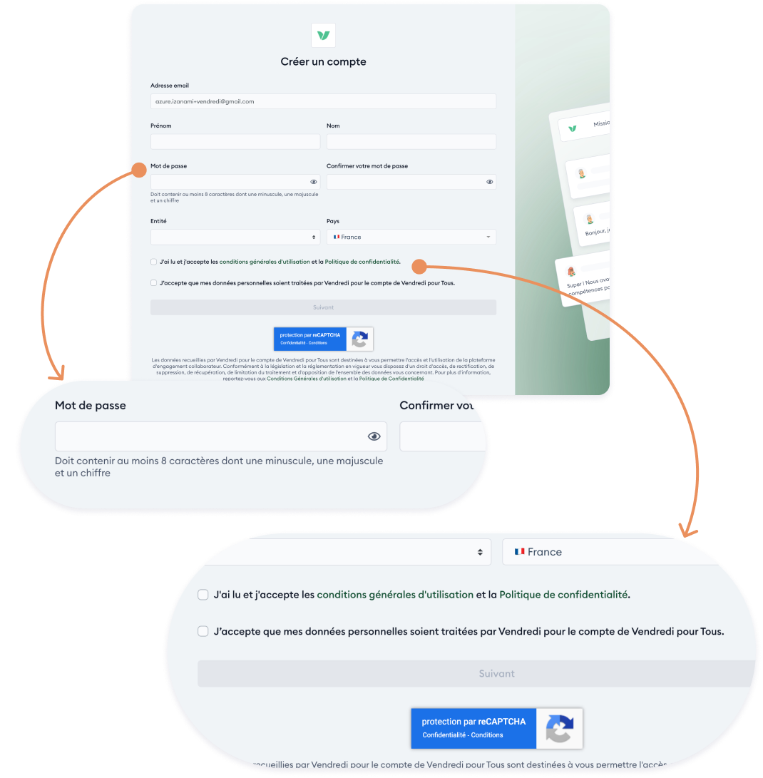
2/7 participants had issues setting up their password
- The password requirements aren't clear to the users.
5/7 participants were worried about the usage of Personal Data
- Vendredi's personal data policy made many users pause. 2 users would have stopped to register for this reason.
I don't want to give them my personal data. I would have stopped there.
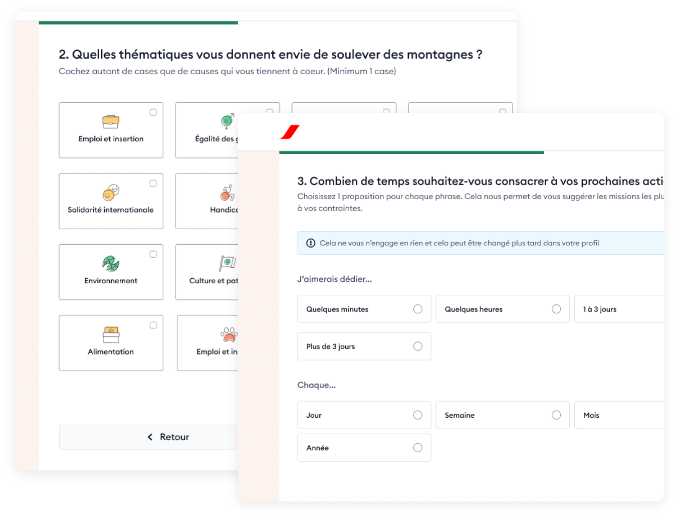
4. Preferences
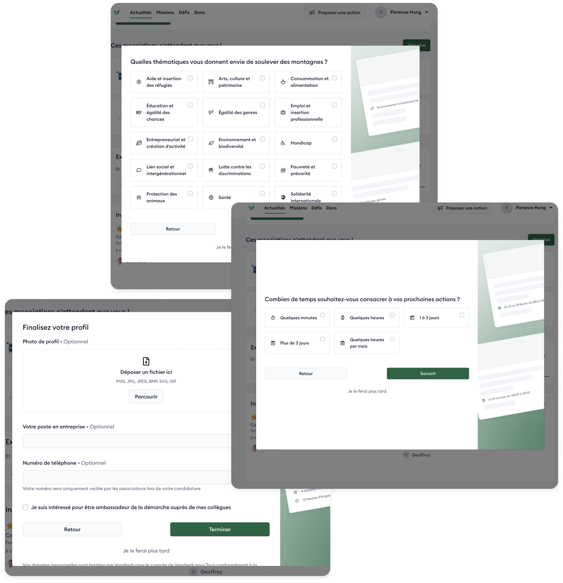
7/7 participants had difficulties understanding the questions
- Wording was confusing. They weren't sure how to answer.
- 5 users skipped the last step because they didn't want to provide a profile picture and phone number.
It's monochrome and cluttered, too dense to read. And the icons are small.
I'm confused about the time scale, is it per week? Per day?
[Add your profile picture]
Do I really need to fill this in?
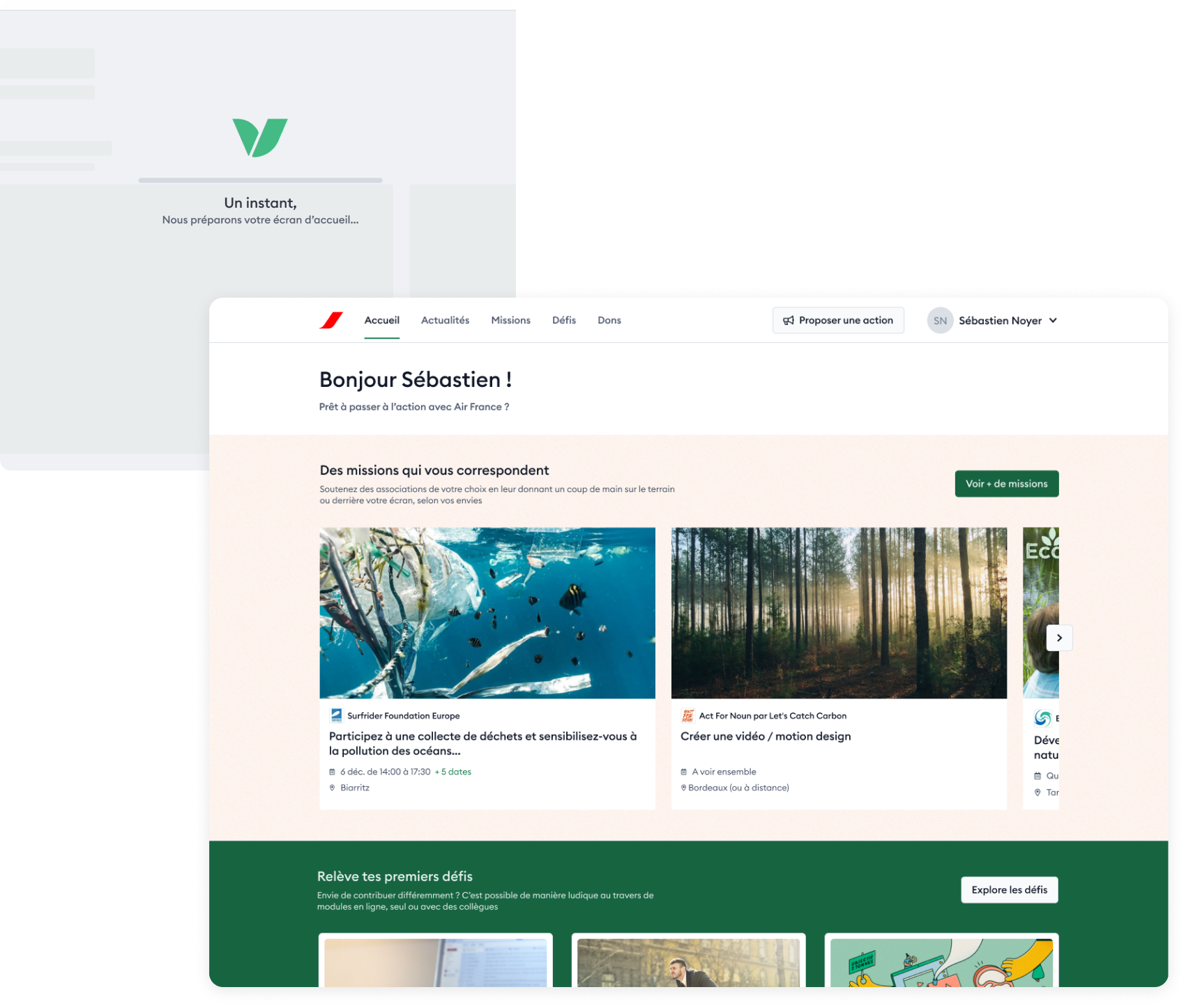
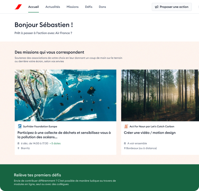
5. Homepage
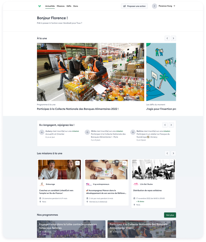
4/7 participants were lost on the Homepage
- Users were overwhelmed by the amount of content.
- 3 out of 3 users with an activist lean struggled to understand how to do their first action as it isn't clearly signposted.
I'm a bit lost. Missions, programs, there are challenges too... I'm not sure where to start.
I want to take action, but I don't know where to click.
Redefining the problem
Using our newfound knowledge, we can focus our efforts onto the real challenge:
“How to make the onboarding experience more engaging for employees?”