“Fixing P$ Mobile Service”
for l’Agence de Mobilité Durable

Logo title

ROLE

Product Designer

TIMELINE

2 weeks (2024)

TOOLS

Figma, FigJam

SCOPE

Problem
Solution

Note: L'Agence de Mobilité Durable was not involved in this mock project. All information and opinion presented in this case study are solely my own.

ABOUT P$ MOBILE SERVICE

P$ Mobile Service (or P$ Service Mobile in French) is the official app from l'Agence de Mobilité Durable, a paramunicipal organisation which depends on the City of Montréal.

This app allows users to pay for on-street parking through their smartphones instead of walking to the nearest pay station. P$ signposts are widely recognisable within the city.

Spotify project

MY ROLE


I executed the entire project alone, hence the smaller scope compared to other case studies where I worked in a team of three people.

MY CHALLENGE

When I first arrived in Montreal, I had to park my car on-street to shop for furniture.
Once parked, I didn't know how to pay for the parking and I definitively didn't want to risk a fine!
That's how I came to download P$ Mobile Service and I remember that I wasn't exactly thrilled about it.

This poor experience motivated me to reimagine this application known by many:

“How can I rethink the app so users won't be discouraged by the experience?”

Spotify project

1. USER RESEARCH

Learning about pain points and reviewing the current version

Before prototyping anything, I had to understand where I stood.

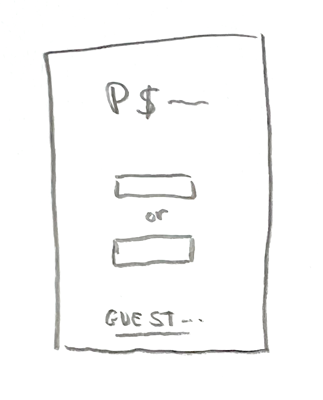
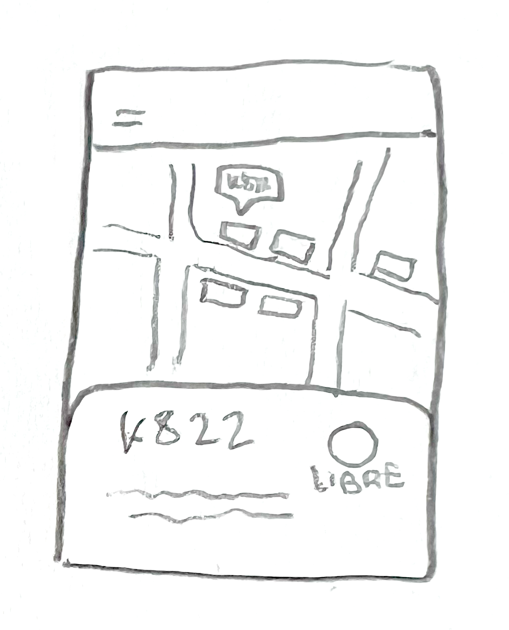
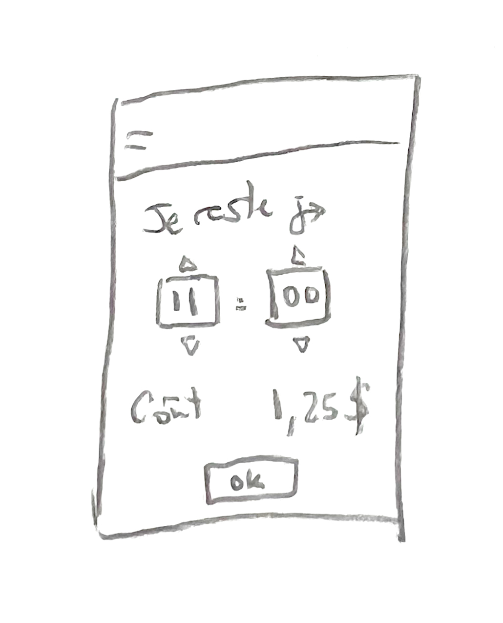
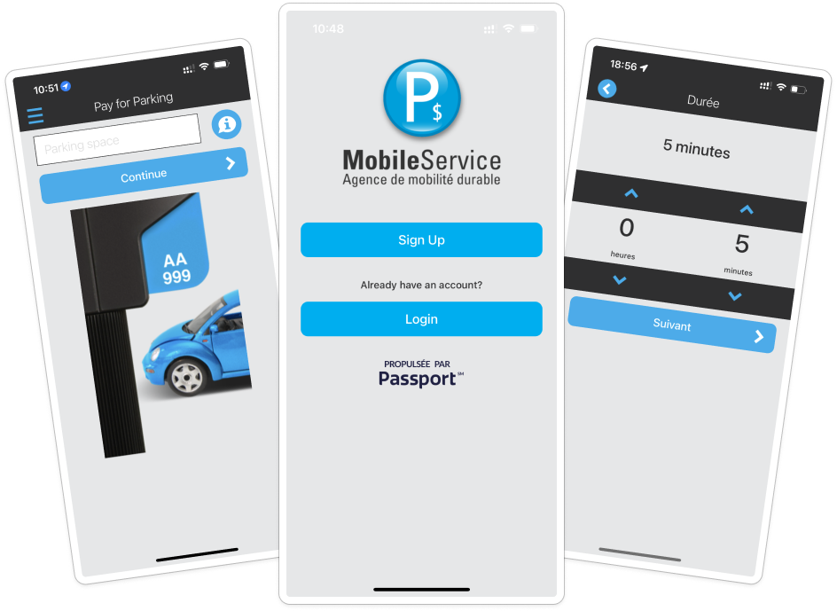
I first reviewed the current app in order to know how it actually works and identify its shortcomings.
To avoid being too much influenced by my own experience, I asked other users about their own experience with the app.

What did I learn?

🎨 5/5 participants agreed on

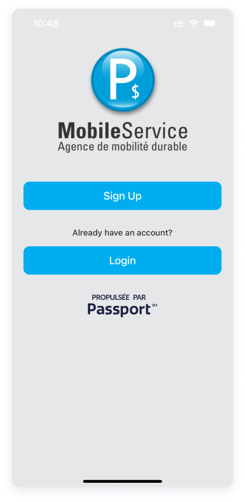
Current design seems outdated and not ”user-friendly”

The app is really, really ugly. It's sad to look at.

Charles

🤔 4/5 participants agreed on

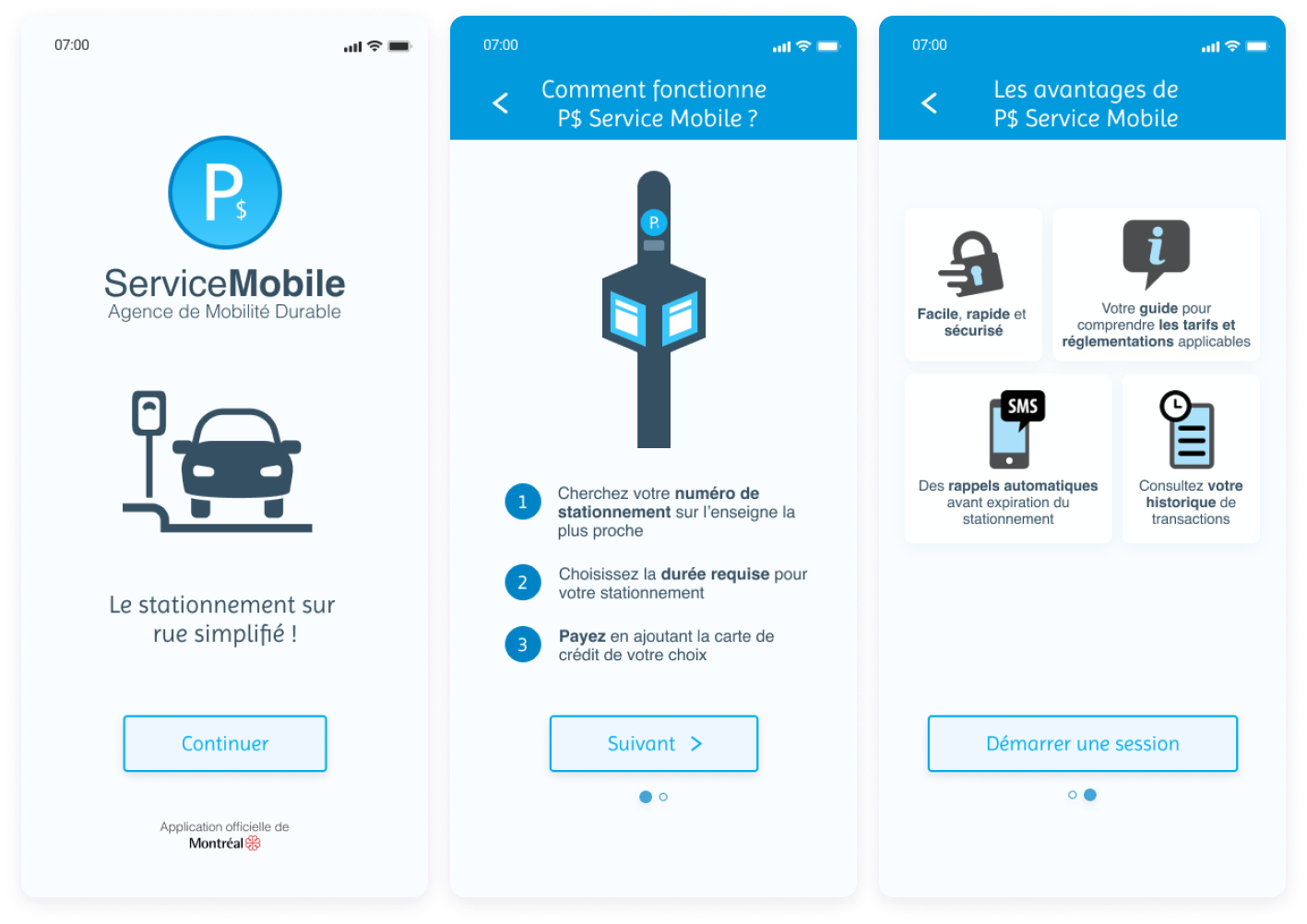
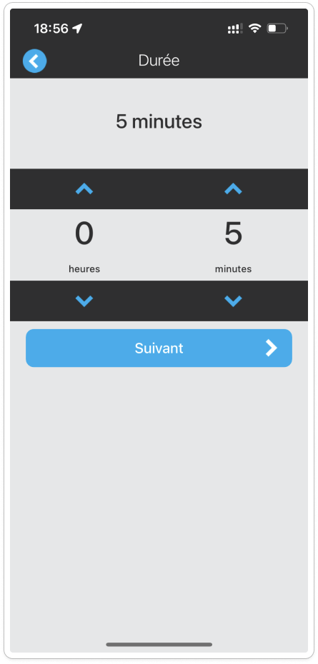
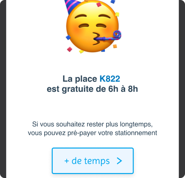
There's not enough guidance within the app, which may lead to confusion

You have no information on how it works. There's an image on the home screen but no explanation, and you have to search to understand it.
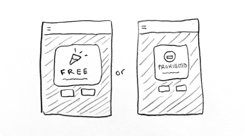
Charlotte

👮‍♀️ 4/5 participants agreed on

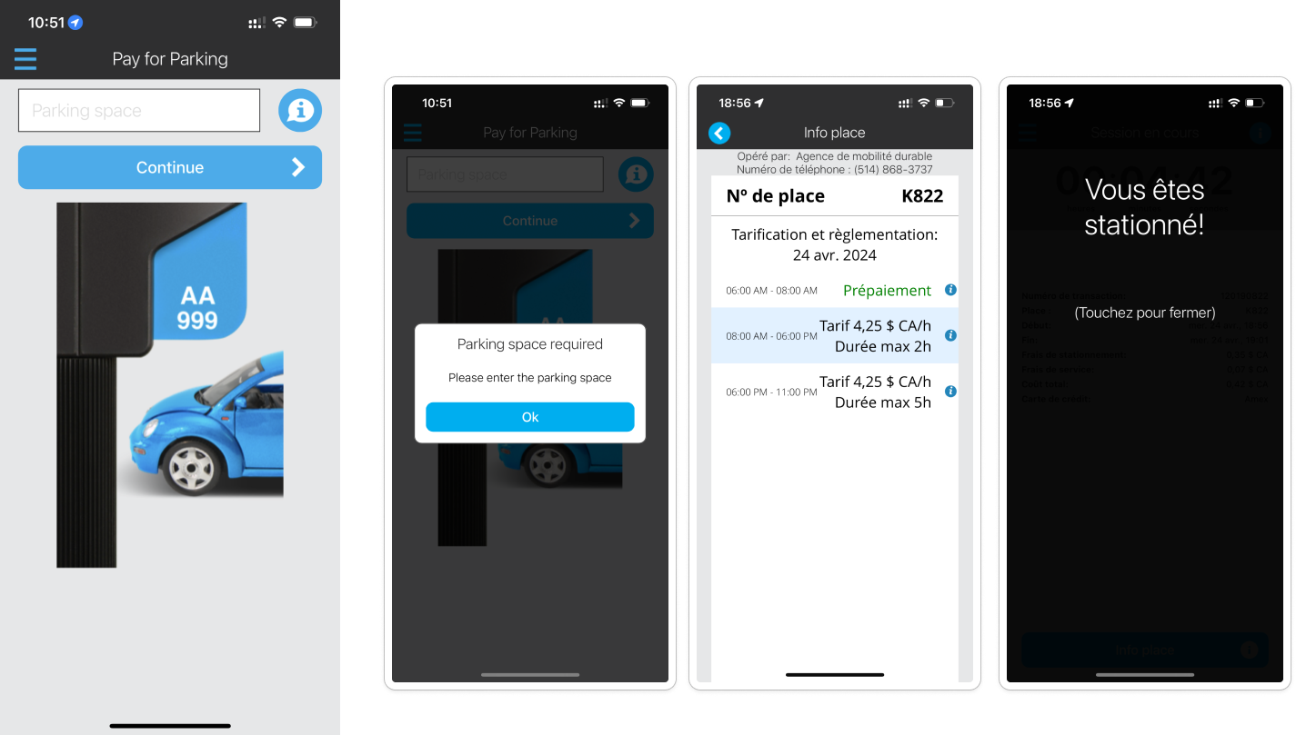
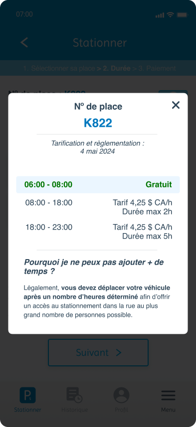
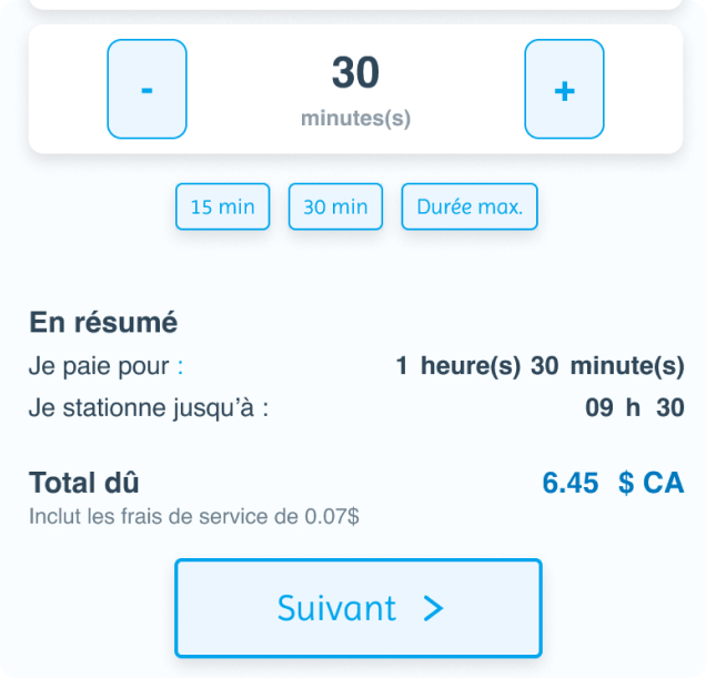
They don't understand the city parking regulations and how they are applied

I can't set it for 4 hours even though I want to stay until 2 PM. And I don't know why.

Dominic

Other remarks

I couldn't directly address the following points that users mentioned, as they were beyond the scope of my project.
However, it seems important for me to highlight them as they have a direct impact on the adoption rate of the application.

There's a lack of communication about the app

  • 2 participants have mentioned they had to look on the Internet before downloading the app since there's no information about it on the pay station nor on the parking signs.

  • They weren't sure of the app's legitimacy and had to double-check before signing-up because the app name is difficult to find and has no keyword such as Parking, Montreal.

Many technical limitations to overcome as a foreigner

  • The first hurdle to overcome for foreigner tourists: being unable to download the app if they do not use a North American app store account.

  • The app fails when using a foreign SIM card, requiring the user to use WiFi which is not available everywhere.

Redefining the problem

Using my newfound knowledge, I can focus my efforts onto the real challenge:

“How might I improve the application for new and occasional users so they gain a trustworthy parking assistant?”

2. IDEATION

Generating many ideas and sorting them, in order to find the best solution for all

After drawing a mind-map with our problem statement as its center, the following 3 keywords drove my focus in finding a solution:

Coherence

  • Making the experience less disjointed

  • Ensuring that screens flow more naturally

Assistance

  • Reassuring by guiding the user step-by-step

  • Giving more contextual information when necessary

Modernised

  • Refreshing the look & feel of the app

  • Making the app feels more appealing by adding a different tone of voice and more illustrations

The idea here was to improve the app, to better it and fix what may be problematic for new users.
Some ideas were rejected along the way, but they helped shape the solution we looked for.

Spotify project

Guest mode

This feature may be a workaround to those who don't want to commit to the app by signing-up.
However, it is only a temporary respite since an account is required to make full use of the app. I rejected it since it may generate more frustration.

Spotify project

Map view

This feature may let you better visualize where you parked and check at a glance if there are free spaces around or if it is prohibited to stay there. It also allows for advance planning.
However, it seems technically difficult to implement and exceeds the scope of the original app.

Spotify project

New type of duration imput

Currently users have to calculate the duration needed for parking in minutes, when it may be sometimes easier for them to predict an ending time (i.e input end at 17:30, instead of 20 min).
However, this change may disorientate users and it swaps one issue for another.

Spotify project

Contextual pop-ups

Since regulations aren't easy to understand and change on a daily basis (sometimes even hour-by-hour), the app could directly inform the user about the specificities of the chosen parking space through a pop-up.
It would make the app more proactive while building trust with the user.

3. PROTOTYPING THE FIRST

ITERATION

3. PROTOTYPING THE FIRST ITERATION

Giving birth to our solution, making it tangible

For this project, I had two things in mind:

  • I took the following stance: ”reorganising the user journey like a jigsaw puzzle”. While I could add new technical features (like adding Apple Pay or signing-up with Google) in my proposal, I decided to avoid that since it requires external approval.
  • I had to create a new visual identity from scratch while keeping it simple and practical first and foremost.

Bringing more legitimacy and information from the start


BEFORE

  • A new user must sign up in order to continue further (even to change the app language).

  • The purpose of the app is not apparent, it may lead users to doubt that they have downloaded the correct app for parking.

  • It is unclear if the app is legitimate, unless you know beforehand what is Agence de Mobilité Durable.

AFTER

  • I modified the user flow right from the start to make it less constraining: a new user can now discover the app before having to commit by signing up.

  • The new splashscreen lets users easily identify the app's purpose and remind them that it is enforced by the city of Montreal.

  • A short onboarding has been added to guide the user on how to use the app.

Guiding the user step-by-step


BEFORE

  • Selecting your parking space may seem simple, except there's no explanation at all beside an illustration.

  • Many elements are using the same blue color, making it difficult to focus on the text field.

  • Regarding the Info button, its purpose changes depending on the screen or inputed text (i.e. error pop-up, another screen about the current regulations or an overlay to let you know you are parked) making it unpredictable.

AFTER

  • I added a breadcrumb with the 3 main steps mentioned during the onboarding to help users visualise on which step they are.

  • On this step, I replaced the Info button with a contextual pop-up that shows the user available options depending on the situation (i.e. free parking or prohibited parking), making the app more proactive, more dynamic.

  • I also added a Tap bar menu so the user always has easy access to the main features of the app.

Dynamic display of the duration & fees


BEFORE

  • When arriving on the duration screen, the app selects the max duration without explanation. The user has to decrease the duration every time, resulting in some frustration.

  • The user only get to see how much it costs after adding your payment info for the first time. There's no mention on how much it will cost until the summary pop-up. This induces user anxiety and confusion.

AFTER

  • When selecting the duration, the app will automatically calculate the fees and the end time while taking into account any special tariffs and conditions (e.g. free period). This reduces cognitive load for the user and improves transparency.

  • When attempting to select a duration in excess of the maximum, the buttons turn red as a visual indicator and the user will get an informative pop-up.

  • The user can double check parking regulations through the ”More info” button on this screen. The rationale behind the maximum duration is also explained.

A deferred signup process


BEFORE

  • The user is forced to sign up before they can explore the app. This is a large barrier to entry that may discourage new users.

  • The process feels disjointed visually due to numerous screens and pop-ups, making it seem less straightforward than it is.

AFTER

  • The user will only be nudged to sign up immediately before payment, after they have already completed two thirds of the user journey.

  • Since it is a one-time event that requires the user to focus, all steps are within the same modal. It also leads the user to perceive the process as quicker.

4. USER TESTING

Putting the prototype into the users’ hands and getting their feedback before moving onto development

With a functional prototype, I can test if my hypotheses are correct and find out how the experience can be improved. Lessons can be learned from this reality check.

🎯 My goals

1

Verify affordance of the whole flow

2

Ensure users better understand the regulations and what they can do

3

Verify that the previous pain points have been properly addressed


Method

📝 Moderated interviews
🎤 1 interviewer 🧑‍💻 Remote (Google Meet)
⏱️ 30 min

Panel

👥 4 people
  • 3 women / 1 men
  • Occasional users of P$ Mobile Service

Scenario

  • After parking, the user downloads the app for the first time before heading out to their appointment. It is 7 am.
  • The user has to stay until 9:30 am. (Parking at this location is free until 8 am).
  • The user changes their mind and wants to stay until 11 am. (The max duration for a parking spot is 2 hours starting from 8 am).

💡 What did I learn?

Most of the experience was perceived positively:

  • Easy to understand and quick to use

There were no issues to complete the given tasks, instead the users emphasised a lot on how it seemed ”quick to use” (when in truth there are more screens than the original app).

I didn't have to leave the app to look for information. I was well guided from the start.

Patricia

Even if you're in a hurry, it's quick and intuitive; it doesn't take very long.

Charlotte

It guides you step by step and is more explanatory. Before, I was afraid of interacting too much with the app for fear that it might delete things.

Valérie

  • Regulations are better understood

While they remain annoyed by the city parking regulations, users aren't confused anymore by the way regulations are described in the app and admitted that they learned something along the way.

Since I had already read the '2 hours max' and it was in red, I didn't have to look any further.

Patricia

I really didn't know that was the case, but now I understand why, because I'm not supposed to stay.

Dominic

It's annoying and limiting, but I understand that in some neighborhoods, you shouldn't hog parking spaces.

Valérie

  • The new design was well received

While it is in line with the previous app design, it no longer attracts criticism. Users appreciate the small additions: more emotion with emoji and visual guidance.

I was focused on the emoji. There was no emotion before, it was quite bland. So I was quite surprised.

Valérie

Clean and neat. It captures well the colors of the current app.

Charlotte

The graphical interface is up to date. It's simple, I think it's very good.

Dominic

I appreciated the visual presentation; the important information was in bold.

Patricia


🛠️ What could I improve?

After sorting the comments from the users, it would appear that they were mostly perplexed by:

Spotify project

A tutorial on how to find parking number

3/4

Users would like to have a reminder of how to spot the parking sign on the ”Select parking” screen.

🔥 High Priority Easy fix

I might have wanted to have the signpost icon on the ”Select your parking” screen as an illustration.

Patricia

Spotify project

An opt-out button on the free parking pop-up

3/4

Users were worried about being coerced into adding more time for parking, they felt the need for another option button.

🔥 High Priority Easy fix

Is there another way to say that I don't need to pay? I mean, to confirm and say it's okay for me to stay until 8 AM.

Patricia

Spotify project

More reassurance needed about the calculation

2/4

Users weren't immediately sure if the free period was included in the calculation or not.

🔥 High Priority

Highlight the fact that there is a free period. That way, I know the app saved me money.

Charlotte

5. ITERATING ON V2

I prioritized which changes I wanted to make, starting with the obvious (what's easiest to fix and has a big impact).

Here's the latest iteration of my solution following feedback from users:

6. CONCLUSION

  • When redesigning an entire app, it is important to consider the other screens and how they interact with each other: What happens if the user is already logged in? How to move out from a parking space to a different one? Which information is available on the History section?

  • After the launch of this new version, the following metrics would be good indicators of its performance: increase in signups, reduction in physical pay station usage. As unusal as it may sound, the number of fines being issued may also provide insight into user understanding of city parking regulations.

Working alone on a project like this was a first. There were no peers to support me. I had to rely more on myself.

The two-week self-imposed deadline put constraints on the scope of the project. I couldn't polish the prototype as much as I'd like since I had to handle everything on my own. That said, it did allow me to improve my UI and prototyping skills.

Besides the redesign, this project reminded me that small changes can make all the difference in how users interact with an app.